Looking Forward to the 2028 Los Angeles Games by Looking Back at Past Olympic Designs
News & Insights
News & Insights
As the Toyko 2020 Olympics have now concluded, we start to look toward the next ones—Beijing 2022, Paris 2024, Milan 2026, and Los Angeles 2028. But as designers with discerning eyes on the “look of the games” we also can’t help but reflect on past Olympics that got us where we are today. The Olympic rings are one of the most widely recognized visual identities, representing the world’s participating continents and the flags of all nations intertwined, and it won’t be long before we see those rings emblazoned throughout our home city of Los Angeles again.
Designers throughout the region are already coming together to create the look of the 2028 Summer Olympics. Key milestones through Olympic history will no doubt inform that work:

1964 TOKYO
1964 was the first time the Olympics was hosted in Asia, as well as the first time that some parts of the games were broadcast live via satellite. Language was a more important consideration than ever before, so these were the first games to consistently use pictograms as easily understood, non-verbal symbols of sports as well as services, helping visitors get where they needed to be.
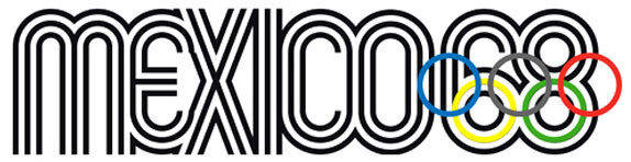
1968 MEXICO CITY
The next Summer Olympics were similar in setting new standards, as these were the first games to be hosted in Latin America. As the games approached, an architect—Pedro Ramirez Vazquez—was tapped to lead Mexico City’s organizing committee; and as SEGD reports, his “appointment ensured that design played a priority role in shaping and promoting Mexico ’68.” Lance Wyman was also brought on board as the director of graphic design for the games, and ultimately designed the visual identity, merging the traditional Olympic rings and the numbers 6 and 8 with a modern graphic representation of Mexico’s culture and heritage.
Design became the way of problem solving for the games from both a visual and logistic perspective, knitting together Mexico City’s dense and diverse urban environment into a cohesive experience with clarity and distinctiveness. Consistent iconography and color coding would reduce the need for verbiage, which would have otherwise required multi-lingual presentation in Spanish, French and English. A highly flexible, modular system of signage hardware also contributed to the first comprehensive, integrated system that could be applied not only to programs, ads and posters (like early Olympic games), but also to urban signage and wayfinding, transit maps, tickets, athletic venues and more.
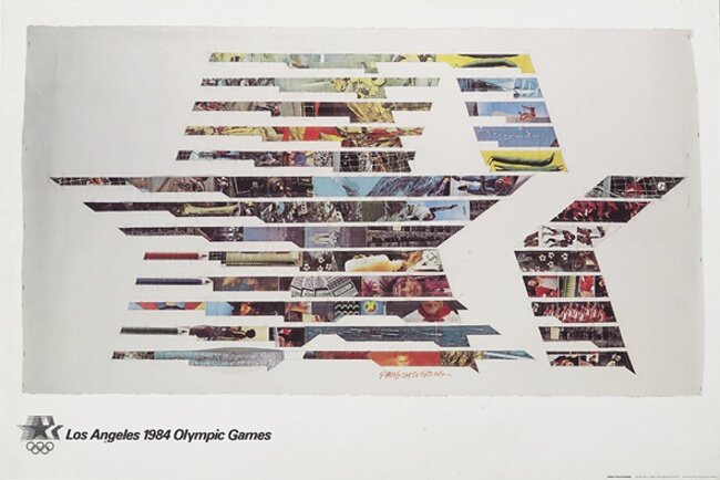
1984 LOS ANGELES
Another dense and diverse location, Los Angeles was—and still is—known for its eclecticism as a collection of distinct neighborhoods, cultures and personalities. These games needed a cohesive approach, similar to Mexico City’s. Here, the design would be led by Deborah Sussman of Sussman Prejza & Co., and by the Jerde Partnership, but many other notable artists and designers would contribute. The “Stars in Motion” visual identity was a symbol of aspiration and achievement combined with movement and speed, and this image set the tone for the whole look of the games. Because a number of suitable venues already existed in the Los Angeles region, the designers created an overlay of temporary graphics, signage and wayfinding that would turn existing spaces and structures into “new” venues. For example, UCLA’s campus became the Olympic Village. A highly flexible kit-of-parts featured colorful and festive graphics and helped to bring a cohesive look to the ’84 Olympics, while representing L.A.’s dynamic personality, creativity and diversity.

2020/2021 TOKYO
These most recent games were unlike any prior Olympics, thanks to the global pandemic that prevented spectators from attending and regional tourism from being featured. But design still played a big role right from the start. During Tokyo’s opening ceremony, we witnessed the Olympic pictograms come to life, honoring Tokyo’s role in establishing the pictogram tradition 57 years prior and shining a unique and memorable spotlight on an important component of Olympic design. Mime-like performers contorted and shifted their bodies and props into configurations that represented 50 different Olympic pictograms in less than 5-minutes.
As we watched from afar, these games felt a little less about the specific place, and more about the power of coming together (even virtually) to overcome challenges, both physical and emotional. Emblematic of the hyper-digital age, these games leveraged design as a backdrop for personal stories that could be told across a multitude of media.
2028 LOS ANGELES
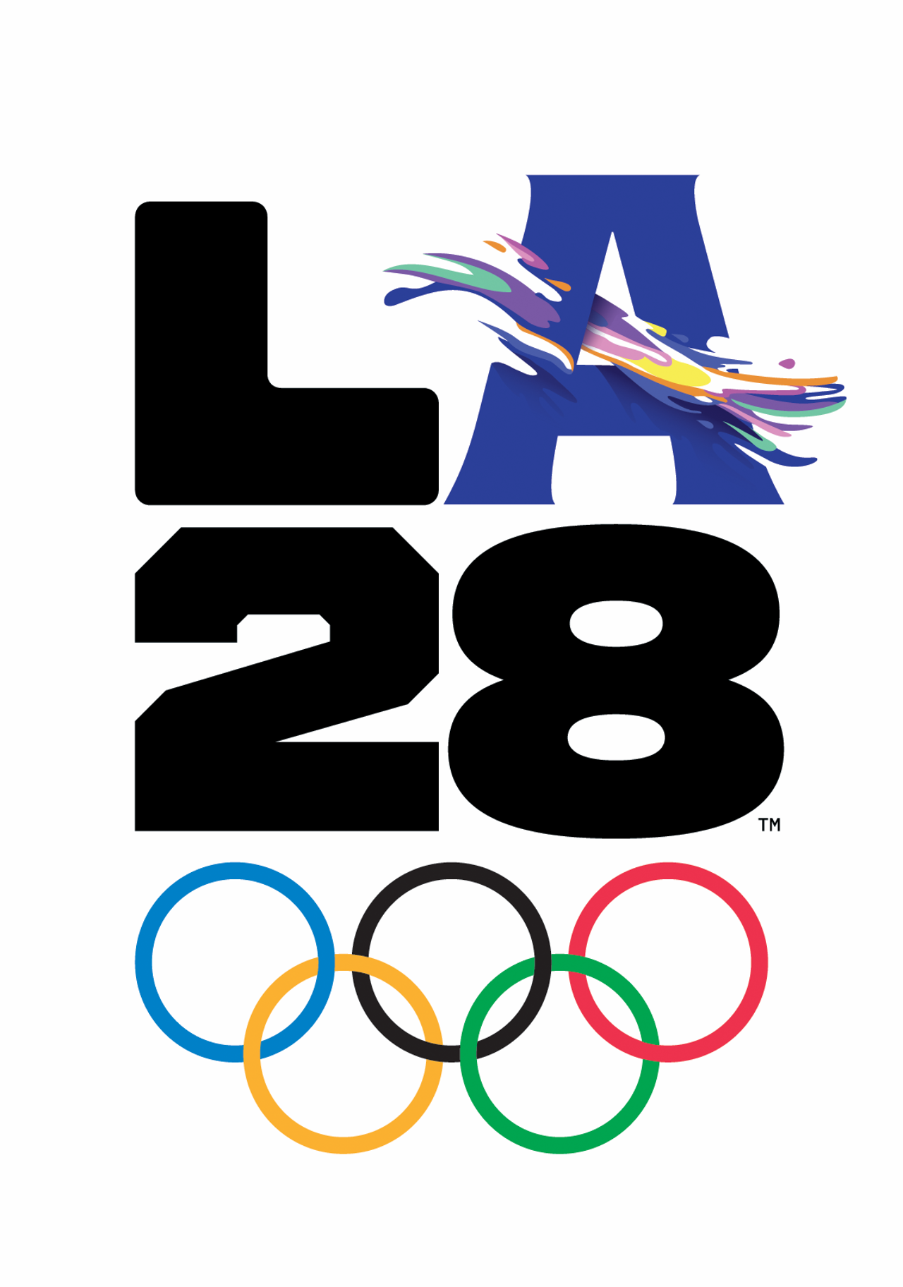
When the games return to Los Angeles in a few years, they’ll build on all of the traditions and precedents set by these (and other) previous games. The look of the games is already coming together with a visual identity anchored by a bold, black L, 2 and 8 that serve as the foundation for a dynamic letter A that expresses individual stories of the games. It’s a clear representation of the organizing committee’s vision for a modern Olympic games that will represent “A Collection of Voices” more equitably than ever before.
Like 1984, the 2028 games will also benefit from L.A.’s existing venues and infrastructure, with UCLA’s campus again serving as the athletes’ village and Downtown L.A. being transformed into an urban sports park. An overlay of temporary graphics, signage and wayfinding will be developed to pull it all together into a cohesive experience across a wide variety of communication channels. It will be decidedly and intentionally ‘of-the-moment’ and yet as you look closely, you’ll undoubtedly see many hints of the past.
We look forward to welcoming the world to Altitude’s hometown and love to talk about design and visual identity. Reach out anytime.


